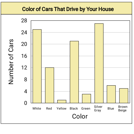
Since we have qualitative data, a different way to display the data is with a circle graph. To do so, we need to find the angle measure for each section of the circle graph by multiplying the fraction of cars of each color by 360^(∘). Let's first find the total number of cars.
25+12+1+21+3+27+6+5
= 100Cars
We can now find the angle measures.
Subject
Angle Measure
Simplify
White
25/100*360^(∘)
90^(∘)
Red
12/100*360^(∘)
43.2^(∘)
Yellow
1/100*360^(∘)
3.6^(∘)
Black
21/100*360^(∘)
75.6^(∘)
Green
3/100*360^(∘)
10.8^(∘)
Silver/Gray
27/100*360^(∘)
97.2^(∘)
Blue
6/100*360^(∘)
21.6^(∘)
Brown/Biege
5/100*360^(∘)
18^(∘)
These angle measures allow us to divide a circle into four sections with their corresponding sizes. Then we can label each section and title the circle graph. Let's do it!
Please note that this is only one possible way to represent the data — there are many other possible ways to do it.
Showing Our Work
Data Display We Used Previously
Since a bar graph allows us to show data in different categories, we used it previously to display the given data set.