Let's begin by identifying the maximum and minimum values from the given data.
Then we can define the intervals for each line of our table.
18, 5, 27, 34, 56, 54, 9, 14, 35, 22, 78, 94, 47, 52, 2, 16, 17, 10
The minimum value is 5 and the maximum is 94. In this case, intervals of 19 seem reasonable. Let's list the intervals in the first column of our frequency table.
Age
Frequency
0 - 19
20 - 39
40 - 59
60 - 79
80 - 99
Now, let's count the number of values in each interval.
18, 5, 27, 34, 56, 54, 9, 14, 35, 22, 78, 94, 47, 52, 2, 16, 17, 10
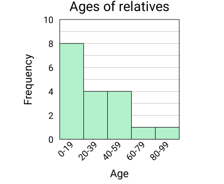
Looking at the data, we can see that there are 8 values in the first interval, 4 values in the second interval, 4 values in the third interval, 1 value in the fourth interval and 1 value in the fifth interval. Now we can complete the second column of our table.
Age
Frequency
0 - 19
8
20 - 39
4
40 - 59
4
60 - 79
1
80 - 99
1
Histogram
Finally, let's make the histogram. We will draw a bar for each interval that we used in the frequency table and make the height of each bar equal to the frequency of the interval. Keep in mind that the bars should touch but not overlap. Do not forget to label the axes!