3. Outliers
Sign In
An error ocurred, try again later!
Chapter 4
3.
Outliers
Understanding the spread of data and the presence of outliers is crucial in statistics. Outliers are data points that significantly differ from others in a dataset. Their presence can skew results and interpretations. The lesson delves into the effects of extreme data values on statistical measures, supported by interactive graphs and real-world examples. It emphasizes the importance of identifying outliers, both through intuitive and formal mathematical processes. For instance, the heights of players in the Harlem Globetrotters basketball team are used as an example to illustrate the distribution and identification of outliers. The lesson also touches upon the historical context, citing Henry Cavendish's experiments from 1798 to determine the Earth's density and the significance of outliers in his data. Overall, the material underscores the importance of careful data analysis, especially when outliers are involved.
Show less Show more expand_more 


Lesson Settings & Tools
| | 9 Theory slides |
| | 8 Exercises - Grade E - A |
| | Each lesson is meant to take 1-2 classroom sessions |
Outliers
Slide of 9
This lesson focuses on investigating extreme data values' effect on various statistical measures and graphic representations. Detailed explanations and problem-solving will be supported by interactive graphs and real-world examples.
Catch-Up and Review
Here are a few recommended readings before getting started with this lesson.
Try a few practice exercises before beginning the lesson. Consider the following data set. -1.9,& -2.1,& 2.9,& -1.6, 8.5,& 7.4,& 3.4,& 0.1, 3.9,& -5.3,& 8.8,& -7.6, 12.8,& 11.1,& -1.5,& 7.3
For each practice exercise give the answer rounded to two decimal places.
a Find the mean.
{"type":"text","form":{"type":"math","options":{"comparison":"1","nofractofloat":false,"keypad":{"simple":true,"useShortLog":false,"variables":[],"constants":[]},"rendered":false},"text":" "},"formTextBefore":null,"formTextAfter":null,"answer":{"text":["2.89"]}}
b Find the first quartile.
{"type":"text","form":{"type":"math","options":{"comparison":"1","nofractofloat":false,"keypad":{"simple":true,"useShortLog":false,"variables":[],"constants":[]},"rendered":false},"text":" "},"formTextBefore":null,"formTextAfter":null,"answer":{"text":["-1.75"]}}
c Find the median.
{"type":"text","form":{"type":"math","options":{"comparison":"1","nofractofloat":false,"keypad":{"simple":true,"useShortLog":false,"variables":[],"constants":[]},"rendered":false},"text":" "},"formTextBefore":null,"formTextAfter":null,"answer":{"text":["3.15"]}}
d Find the third quartile.
{"type":"text","form":{"type":"math","options":{"comparison":"1","nofractofloat":false,"keypad":{"simple":true,"useShortLog":false,"variables":[],"constants":[]},"rendered":false},"text":" "},"formTextBefore":null,"formTextAfter":null,"answer":{"text":["7.95"]}}
e Find the standard deviation.
{"type":"text","form":{"type":"math","options":{"comparison":"1","nofractofloat":false,"keypad":{"simple":true,"useShortLog":false,"variables":[],"constants":[]},"rendered":false},"text":" "},"formTextBefore":null,"formTextAfter":null,"answer":{"text":["5.84"]}}
Explore
Share
Report error
Effects of One Data Value's Change on a Data Set
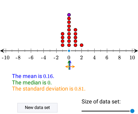
The dot plot below shows the distribution of a data set.
- Move the blue dot on the number line to explore how the change of one data value affects the median, the mean, and the standard deviation.
- Move the slider to explore how the effect of the change in one data value depends on the size of the data set.
Discussion
Share
Report error
Outlier
An outlier is a data point that is significantly different from the other values in the data set. It can be significantly larger or significantly smaller than the others.

Categorical data sometimes also have unusual elements; these can be called outliers as well.

However, it is best to use the term outlier when applying a mathematical process to identify it. This approach helps differentiate between an intuitive and a more formal approach.
Extra
Explaining "Significantly Different"What significantly different
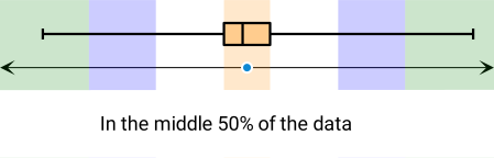
means can depend on many things. For numerical data, the following definition is one of the several approaches that can be used. A data value can be considered an outlier if it is farther away from the closest quartile than a certain multiple of the interquartile range.
- The multiplier 1.5 is commonly used to identify outliers. This value was suggested by the esteemed American mathematician John Tukey.
- The multiplier 3 is sometimes used to identify extreme outliers.
Example
Share
Report error
Identifying Outliers in a Data Set
The box plot below shows the distribution of the heights (in inches) of all the players who have ever played for the Harlem Globetrotters basketball team. The heights of six of the players are indicated on the number line with dots.
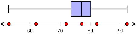
Select all the outliers from the given list.
{"type":"multichoice","form":{"alts":["Jahmani <q>Hot Shot<\/q> Swanson (4'5'')","Jonte <q>Too Tall<\/q> Hall (5'2'')","Paul <q>Tiny<\/q> Sturgess (7'8'')","Donald <q>Ducky<\/q> Moore (6'0'')","Solomon <q>Bam Bam<\/q> Bamiro (6'5'')","Sean <q>Elevator<\/q> Williams (6'10'')"],"noSort":false},"formTextBefore":"","formTextAfter":"","answer":[0,1,2]}
Hint
Compare the length of the whiskers to the width of the box.
Solution
Since the scale on the box plot is given in inches, first the given height data should be converted to inches.
| Name | Height | Height in inches |
|---|---|---|
Jahmani Hot ShotSwanson |
4'5'' | 12* 4+5=53 |
Jonte Too TallHall |
5'2'' | 12* 5+2=62 |
Donald DuckyMoore |
6'0'' | 12* 6+0=72 |
Solomon Bam BamBamiro |
6'5'' | 12* 6+5=77 |
Sean ElevatorWilliams |
6'10'' | 12* 6+10=82 |
Paul TinySturgess |
7'8'' | 12* 7+8=92 |
Heights in the boxed section of the chart can be considered typical; they are not outliers. Heights close to the box are not typical; still, they are not extreme.
- The height of Solomon
Bam Bam
Bamiro is the median height. This height is not an outlier. - The height of Donald
Ducky
Moore is a bit less than the first quartile but not far away. This height is not an outlier. - The height of Sean
Elevator
Williams is a bit more than the third quartile, but not far away. This height is not an outlier. - The heights of Jahmani
Hot Shot
Swanson and JonteToo Tall
Hall are much less than the first quartile. These heights are outliers. - The height of Paul
Tiny
Sturgess is much more than the third quartile. This height is an outlier.
Extra
Sometimes box plots are drawn in a way that highlights outliers. In this case, the whiskers are only drawn to the last data value that is not considered an outlier, and the outliers are indicated separately.
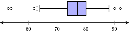
The box plot in this example was drawn based on the data values of 696 players' heights who played for the Harlem Globetrotters over the years. Here is a list of all of the players who are classified as unusually short or tall compared to all of the other players.
- Jahmani
Hot Shot
Swanson (4'5'') - Justion
X-Over
Tompkins (4'6'') - Jonte
Too Tall
Hall (5'2'') - Cherelle
Torch
George (5'3'') - Jimmy
Pee Wee
Henry (5'3'') - Dut Mayar (7'6'')
- Paul
Tiny
Sturgess (7'8'')
In the last box plot, the height 5'3'' was classified as an outlier, but the height 5'4'' was not. The reason for this is that a graphing calculator was used, and it applied its own methodology. The histogram can give more details than a box plot and can indicate a different approach to classifying outliers.
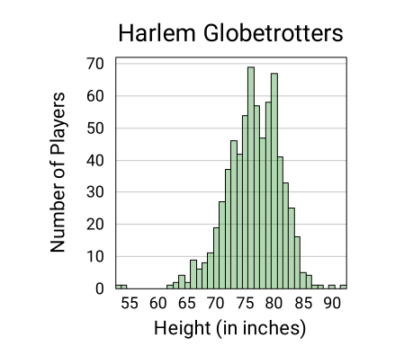
In this context, it can be argued that only the heights below 60 inches are considered to be outliers on the low end of the data.
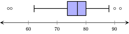
Identifying outliers is not a strict process. Context can modify what the generally accepted numerical method indicates.
Example
Share
Report error
Analyzing the Effect of Outliers on the Mean
In 1798 Henry Cavendish published the results of 29 experiments aimed to determine the density of the Earth. The table below shows his measurements relative to the density of water. 5.50& 5.61& 4.88& 5.07& 5.26& 5.55 5.36& 5.29& 5.58& 5.65& 5.57& 5.53 5.62& 5.29& 5.44& 5.34& 5.79& 5.10 5.27& 5.39& 5.42& 5.47& 5.63& 5.34 5.46& 5.30& 5.75& 5.68& 5.85 Identify an outlier and calculate the mean of the data with and without including the outlier.
Answer
Outlier: 4.88
Mean With Outlier: 5.45
Mean Without Outlier: 5.47
Hint
Note that one data value appears to be much less than the average of the others.
Solution
All values are above 5 except one, that is 4.88. This observation can be confirmed by placing all values on a number line.

Investigating this plot reveals that most values are between 5.3 and 5.7, while a few are below 5.3 and a few are above 5.7. The one value that is furthest away from the middle group is 4.88. Outlier: 4.88 Calculators can find the mean of the data. At the time Cavendish published this experiment, electronic calculators were not in existence. By hand, the mean was calculated by dividing the sum of all the values by 29. Mean With the Outlier [0.1cm] 157.99/29≈ 5.45 To find the mean without including the outlier, 4.88 can be subtracted from the sum and the result divided by 28. Mean Without the Outlier [0.1cm] 157.99-4.88/28≈ 5.47
Extra
It is interesting to see what the original publication says about the mean and how this mean compares to the value accepted today.
- In his paper Cavendish claimed that the mean is 5.48. That, however, does not match either of the calculated values. Some sources note that if 4.88 is replaced by 5.88, then the mean is 5.48, as claimed by Cavendish. Is it possible that Cavendish made this adjustment?
- In actuality, during the experiment, Cavendish modified the equipment a bit after the first six results. If these results are removed, the mean of the remaining 23 data values is 5.48.

- The density of the Earth measured by advanced modern techniques is 5.52. How amazing that Cavendish was so close to this value more than 200 years ago.
Example
Share
Report error
Statistics of Data with Different Histogram Shapes
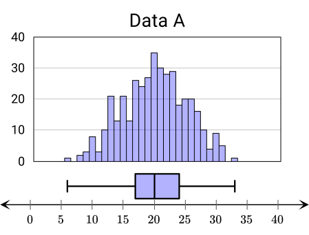
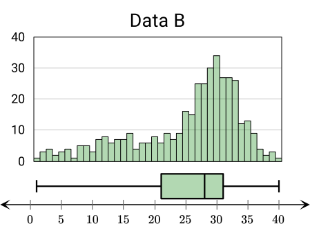
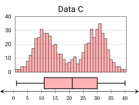
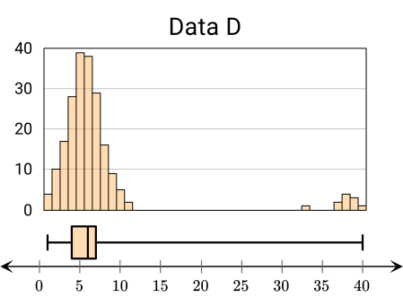
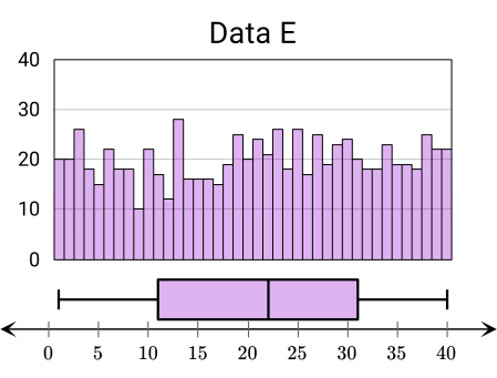
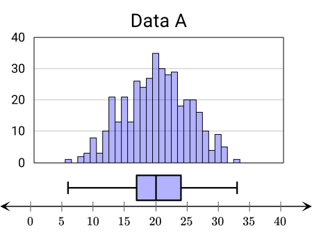
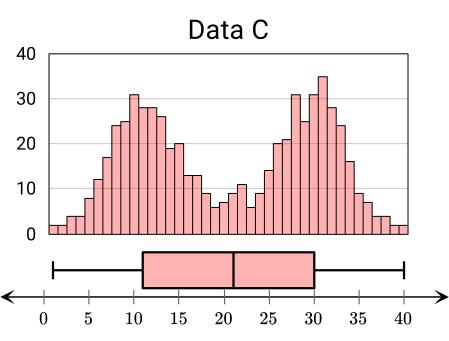
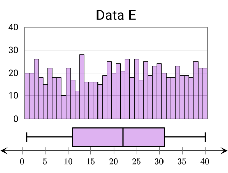
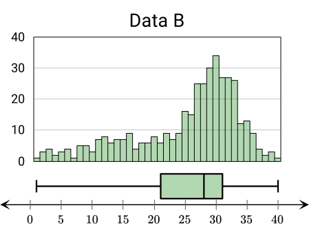
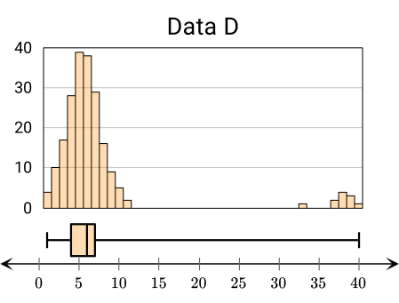
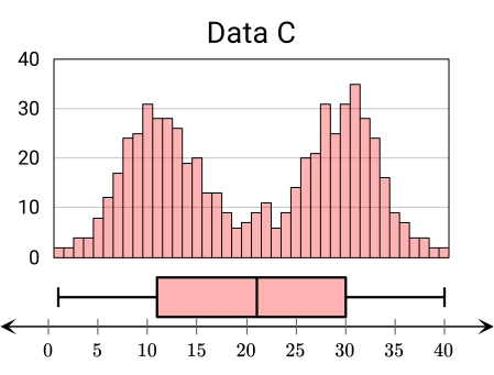
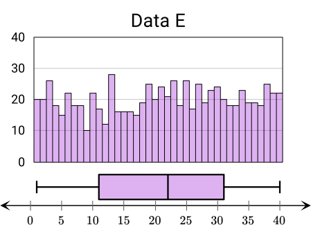
Consider the five data sets illustrated by the histograms and the corresponding box plots.
{"type":"multichoice","form":{"alts":["Data A","Data B","Data C","Data D","Data E"],"noSort":true},"formTextBefore":"","formTextAfter":"","answer":[0,2,4]}
b For two of the data sets, the mean and median do not describe a typical value of the data set well. Determine which two.
{"type":"multichoice","form":{"alts":["Data A","Data B","Data C","Data D","Data E"],"noSort":true},"formTextBefore":"","formTextAfter":"","answer":[2,4]}
Hint
a Look for symmetric or skewed distributions.
b Look for the distribution where the median represented in the box plot is not close to the peak of the histogram.
Solution
a Note that, approximately, for symmetric distributions, both the mean and the median are close to the midpoint of the range. Data A, C, and E have approximately symmetric histograms and box plots. Therefore, for these data sets, the mean is close to the median.
The histogram for Data B is skewed to the left. The outliers to the left of the distribution bring the mean a bit to the left of a typical data value. Note that the box plot shows that the median is close to the peak of the distribution.
The histogram for Data D is skewed to the right, with only a few extreme outliers on the right of the distribution. These outliers bring the mean a bit to the right of a typical data value. Note that the box plot shows that the median is close to the peak of the distribution.
b For Data C, there are two peaks in the histogram. This characteristic represents a type of distribution called bimodal distribution. Correspondingly, both the mean and the median are close to the center of the range, between the peaks. Therefore, neither the mean nor median of Data C are good indicators of a typical data value.
For Data E, there is no clear peak in the histogram. This characteristic represents a uniform distribution where all values of the range are expected to appear with approximately the same frequency. Therefore, neither the mean nor median of Data E are good indicators of a typical data value.
Extra
The table below contains the mean, the median, the standard deviation, and the interquartile range for all five distributions.
| Mean | Median | Standard Deviation | Interquartile Range | |
|---|---|---|---|---|
| Data A | 20.15 | 20 | 5.13 | 7 |
| Data B | 25.36 | 28 | 8.54 | 10 |
| Data C | 20.58 | 21 | 9.92 | 19 |
| Data D | 7.26 | 6 | 7.52 | 3 |
| Data E | 21.05 | 22 | 11.57 | 20 |
Discussion
Share
Report error
Connection Between Different Data Distributions and Best Statistics
The following observations can be summarized from the previous example.
| Data's Distribution | Some Observations | Preferred Statistics |
|---|---|---|
| Symmetric Distribution | Both the mean and the median are close to the center. | If the histogram has one peak, then both mean and median describe a typical data value. In this case, the preferred statistic is the mean, since it also considers the actual data values, not just the order. |
| Skewed Distribution or With Outliers | The extreme values can distort the mean and increase the standard deviation. | In this case, the preferred statistic to describe a typical data value is the median, since it only considers the order of the data. Furthermore, it is less sensitive to extreme values. |
When analyzing the center of the data, it is often very useful to investigate the measure of spread too. Here are two examples of how different statistics can be paired.
- The mean is paired with the standard deviation, since both formulas use the actual data values.
- The median is paired with the interquartile range, since both of these are worked out using the order of the data.
Pop Quiz
Share
Report error
Choosing the Best Statistics for Data Sets
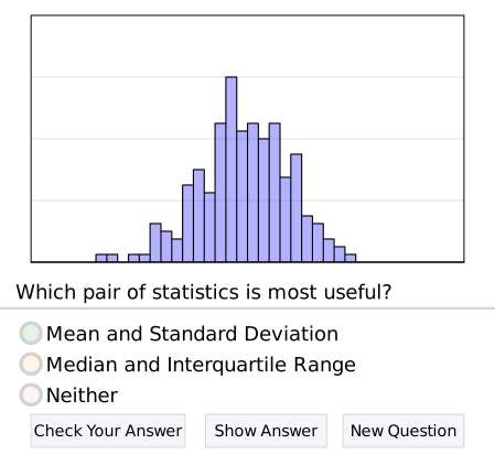
There are several statistics used to describe a data set: mean, median, standard deviation, and interquartile range. Some are more useful than others depending on the case. Analyze the shape of the following histogram of a data set. Then, select the most appropriate pair of statistics that would best describe it. Try out a few!
Closure
Share
Report error
Why Do Outliers Appear?
As it was previously noted, outliers are characterized as unusual values in a data set. Outliers can appear for several reasons.
| Possible Reason | Example |
|---|---|
| It can be a result of a data recording error. If this is obvious, then this data can be removed or modified. | Suppose a scientist records the length of some leaves from a tree in centimeters, measured to the nearest millimeter. In that case, a typical data entry has one decimal place. Yet, if the value 104 appears in the data, then it is likely that it was mistakenly recorded and meant to be recorded as 10.4. |
| The nature of the data is such that unusual entries can occur. In this case, this entry should also be considered. Still, usually, the median better describes a typical data value than the mean. | When looking at a data set of the heights of Star Wars characters, one should expect to see a few extremely low and high values. |
Extra
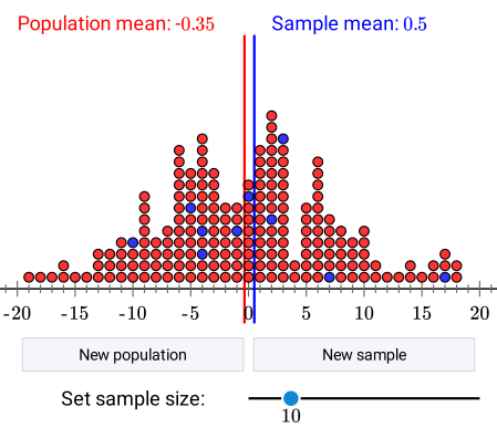
As a concluding remark, it should be mentioned why statisticians are so interested in investigating data. They can use the statistics of a sample to estimate the parameters of a population. Consider the following example.
- Suppose a biologist would like to find the average wingspan of a certain species of bird. They can catch a few birds and measure their wingspan. Based on that sample, they can then make estimates. Although the true average wingspan will not be known, the biologist will have a reasonable estimate.
Outliers
Exercise 3.1
There are 13 people in a nightclub. Their average age is 30 years. If a patron must be at least 21 years old to enter the nightclub, what is the lowest number of people that must enter the nightclub for the average age to drop to under 25 years?
{"type":"text","form":{"type":"math","options":{"comparison":"1","nofractofloat":false,"keypad":{"simple":true,"useShortLog":false,"variables":["x"],"constants":["PI"]},"rendered":false},"text":" "},"formTextBefore":null,"formTextAfter":"people","answer":{"text":["17"]}}
security
report
code
security
report
code
Let's first calculate the sum of the ages of the people inside the nightclub.
To lower the mean age by as much as possible, the people entering the club should be as young as possible. Remember that patrons must be at least 21 years old to enter the club. Let's call the number of people who enter the club x. Then, the sum of the ages of the patrons in the club increases by 21x if all of newcomers are as young as possible. Sum of ages: 390 + 21x We can also write an expression for the number of people in the club. Number of people: 13 + x Now we can write an expression for the new mean. Mean=390+21x/13+x We want the mean to be less than 25. This leads us to set and solve an inequality.
As we can see, the number of people must be greater than 16.25 to lower the mean age of the patrons to below 25. However, since we cannot have a fraction of a person inside the club, we have to round that number up to 17.
security
report
code
Students Tiffaniqua and Ramsha are discussing mean and median. Tiffaniqua claims that the mean of three consecutive numbers also equals the median of those. Ramsha says that the numbers do not have to be consecutive as long as the difference between adjacent numbers is constant. Is either of the students correct?
{"type":"choice","form":{"alts":["Only Tiffaniqua is correct.","Only Ramsha is correct.","Both are correct.","Neither is correct."],"noSort":true},"formTextBefore":"","formTextAfter":"","answer":2}
security
report
code
security
report
code
Let's investigate the two claims, one at the time.
Tiffaniqua's Claim
Three consecutive numbers are, for example, 4, 5, and 6. In this case, the median is 5. Let's calculate the mean.
In this specific case, the mean and median are equal. However, let's also prove this for the general case. If we call the first number n, then the second number, which is also the median, is n+1. The third number is n+2.
Let's calculate the mean.
The mean is n+1, which was also the median. As we can see, Tiffaniqua is correct.
Ramsha's Claim
Consecutive numbers implies that the difference between adjacent numbers is 1. However, Ramsha claims that the numbers do not have to be consecutive as long as the difference between adjacent numbers is constant. Let's call the first number n again. This time we will call the difference between adjacent numbers d.
The median here is n+d. Now let's calculate the mean.
The mean is n+d, which is also the median. Consequently, Ramsha is correct as well. Therefore, both students are correct.
security
report
code
Outliers
Recommended exercises
To get personalized recommended exercises, please login first.
Loading content
≤
>
■2
■▢
e▢
7
8
9
×
÷■1
=
=
√▢
▢√
∫▢▢
4
5
6
+
−
≤
<
log
ln
log▢
1
2
3
()
∣
sin
cos
tan
0
.
π
x
y
Loading content