Sign In
Comparing Data Sets
| | 11 Theory slides |
| | 9 Exercises - Grade E - A |
| | Each lesson is meant to take 1-2 classroom sessions |
Catch-Up and Review
Here are a few recommended readings before getting started with this lesson.
- These are measures of the center of a data set.
- These are measures of the spread of a data set.
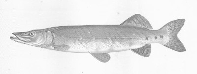
Analyzing Data Sets of Finnish Fish Species

Match the Finnish name with the Latin name.
Pairing Teams to Sports Using Median Heights
The following box plots show the distribution of the heights (in feet and inches) of the players on the Ohio State Buckeyes men's basketball and football teams in the 2020–2021 season.

Hint
Of the two sports, which tends to place more importance on a player's height? Identify the maximum and the median heights of each team.
Solution
The box plots show that the range of heights is similar for both teams, but Team B, on average, has taller players.
- The tallest player on Team B is 6 feet 10 inches tall, and the median height is 6 feet 6 inches.
- The tallest player on Team A is 6 feet 8 inches tall, and the median height is 6 feet 2 inches.
Height tends to be more advantageous in basketball than in football. Therefore, it is reasonable to conclude from the box plots that Team B is the basketball team and Team A is the football team.
Extra
Represented using a histogram, the same data set is used to show the distribution of the height of the players on the two teams.

Analyzing a Data Set to Determine Geographical Locations
The table below shows the average monthly high temperatures across three small towns.
![Temperatures in Noma=[63,67,75,80,86,90,95,92,88,80,73,69], Mekoryuk=[-9,3,25,43,57,67,70,65,53,29,5,-5], Nehawka=[34,48,58,66,75,87,87,83,82,69,58,40]](/mediawiki/images/8/85/Mljsx_Slide_A1_U4_C2_Example2_1.svg)
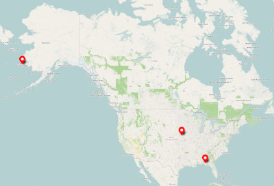
One town is located in the State of Alaska, another in Florida, and the other in Nebraska.
Analyzing the data set and map, try to match each town with the correct corresponding state. Note that, generally, northern states tend to be colder than southern states.
Hint
Think about the relationship between the location and climate of each state of Alaska, Nebraska, and Florida. Then, consider each month's average high temperatures as shown in the data set. Which town is the warmest? Which town is the coldest?
Solution
Investigating the given data set and map, the following observations can be made.
- When comparing each town's average monthly high temperatures, the weather is coldest in Mekoryuk and warmest in Noma.
- Next, observing the map with a keen eye, Florida is the furthest south of these three states. It is likely — on average — to be the warmest. Therefore, it would make sense to match Florida with the town with the highest average monthly temperatures as described in the table.
- Again, observing the map, Alaska is the furthest north of the three states. It is likely — on average — to be the coldest. Therefore, it would make sense to match Alaska with the lowest average monthly temperatures as described in the table.
Considering each observation from the data set and map, it is likely that Noma is in Florida, Mekoryuk is in Alaska, and Nehawka is in Nebraska.
Comparing Means in Histograms
The following applet shows the histograms of two data sets. Move the slider to investigate the observations separately.

Mean Absolute Deviation and Standard Deviation
Standard Deviation

Extra
Comparison of Standard Deviation and Mean Absolute Deviation(a−b)2=a2−2ab+b2
LHS+a2+2ab+b2≤RHS+a2+2ab+b2
LHS/4≤RHS/4
Factor out 2
a2+2ab+b2=(a+b)2
Simplify quotient
LHS≤RHS
Using Measures of Spread in Geography
The table below shows the average monthly low temperatures of two cities — Kansas City and Seattle. The two cities given are not necessarily in order.
![Temperatures: city A = [36,37,39,43,47,52,54,55,52,47,41,38], city B = [18,20,29,40,50,60,66,65,58,47,37,28]](/mediawiki/images/d/d6/Mljsx_Slide_A1_U4_C2_Example3_1.svg)
According to the data set, City A and B have annual average low temperatures around 45∘F and 43∘F, respectively. Referencing the map below, Seattle is located much further north than Kansas City. It is typical that northern states — on average — are colder than southern states. Nevertheless, Seattle experiences less variance in temperature changes during each season due to the ocean's tempering effect on the climate.

Hint
Think of the climate similarities and differences of coastal areas compared to inland areas. Find the range and standard deviation of the temperatures.
Solution
Using the range and standard deviation — measures of spread — will help compare the two cities' average low temperatures. A graphing calculator can be used to find the standard deviation.
| Range | Standard Deviation | |
|---|---|---|
| City A | 55−36=19 | 6.7 |
| City B | 66−18=48 | 16.4 |
These measures of spread show that the temperature throughout the year changes much less in City A than in City B. Based on that analysis, and considering the information given about the tempering effect of the ocean, it is reasonable to conclude that City A is Seattle and City B is Kansas City. What a cool conclusion to make.
Stock Price Volatility
In the US stock market, a measure of how much a stock price fluctuates during a certain period of time is called historical volatility. The following data set from the year 2020 contains information about the daily closing stock price (in dollars) of two companies.
| Low | Mean | High | Standard Deviation | |
|---|---|---|---|---|
| APDN | $2.52 | $6.89 | $15.21 | $2.24 |
| DSS | $4.04 | $6.90 | $10.89 | $1.69 |
Which stock price was less volatile in 2020?
Hint
Which part of the table gives information about the spread of the stock price?
Solution
The numbers in the given table can be interpreted into the following sentences.
- The two companies' mean stock price was very close for the year — separated merely by one-cent!
- The range for APDN is the high of $15.21 minus the low of $2.52, which is $12.69. In comparison, the DSS range is the high of $10.89, minus the low of $4.04, which is $6.85.
- The standard deviation for DSS, $1.69, is smaller than the standard deviation for APDN, $2.24.
Both the range and standard deviation are smaller for DSS. These interpretations indicate that DSS's stock price fluctuated less over the year than the stock price of APDN. Therefore, it can be concluded that the stock price of DSS was less volatile in 2020.
Extra


Visually Inspecting the Standard Deviation in Histograms

Analyzing Histograms by Their Shapes
Consider the following two histograms where neither the labels nor scales are specified.

Both of these histograms represent different distributions, and both have 26 columns.
- One histogram shows the distribution of the numbers drawn in the Powerball lottery game since the latest version was introduced in 2015. In this version of the game, the randomly drawn Powerball number is between 1 and 26.
- The other histogram shows the distribution of AMC 8 (American Mathematics Competition) results in 2020. In this competition, participants had 25 multiple-choice questions in which a student could answer between 0 and 25 correctly. The histogram shows how many correct answers the participants received.
Hint
In a lottery, all numbers are drawn with equal probability.
Solution
In a mathematics competition, only a few students answer all questions correctly. Still, a lot of students will be able to answer at least some of the questions correctly. Consequently, it is likely that the histogram is shaped like a mountain, with a peak in the center and low ends. The shape of Histogram A reflects this behavior.

In a lottery, all numbers are drawn with equal probability, so in the long run, it can be expected that there is little difference between the frequencies. The shape of Histogram B reflects this.

There is even more fascinating information to be discovered from the shapes of the histograms.

The height of the lone tall bar furthest to the left in Histogram A shows that in the AMC 8 competition, there were plenty of participants in 2020 who did not answer a single question correctly! Well, it is much more likely, however, that these participants registered but did not attend the competition.

Histogram A's peak shows that in 2020, on average, students in the AMC 8 competition answered less than half of the questions correctly.

The fluctuation of the bar heights in Histogram B shows that although an even distribution of the numbers is expected on the Powerball draw, some numbers historically came out fewer times.

The bar corresponding to 24 is more than twice as high as the bar corresponding to 16. However, this does not mean that 24 is twice as likely to come out in a draw. Nor does this mean that players should now play 16 because it will eventually catch up. The data is historical; it does not have any effect on the next draw.
Applying Various Methods to Analyze Data


| Mean Length to Height Ratio | |
|---|---|
| Abramis Bjorkna | 2.55 |
| Leuciscus Rutilus | 3.75 |
| Osmerus Eperlanus | 5.95 |
| Esox Lucius | 6.33 |
Next, the actual drawings can be used to find their length to height ratios. This measurement, however, is in pixels instead of centimeters. Most image software on a standard computer can show these measurements. Here, they are given. Recall that the drawings use the Finnish names.


The results, in increasing order, can be summarized as follows.
| Length to Height Ratio (Images) | |
|---|---|
| Pasuri | 120361≈3.01 |
| Särki | 106393≈3.71 |
| Hauki | 59358≈6.07 |
| Norssi | 55358≈6.51 |
The numbers in the two tables do not match exactly, which would make sense given that they are measured using different measurements, and the images are not matching in scale. Still, in both tables, two species have a ratio above 5 and two species have a ratio below 4. That means the following distinction can be made.
| Latin Name (Data Set) | Finnish Name (Images) | |
|---|---|---|
| Longer Fishes | Osmerus eperlanus and Esox lucius | Hauki and Norssi |
| Taller Fishes | Abramis bjorkna and Leuciscus rutilus | Pasuri and Särki |
| Latin Name | Finnish Name | English Name |
|---|---|---|
| Abramis Bjorkna | Pasuri | Bream |
| Leuciscus Rutilus | Särki | Roach |
| Osmerus Eperlanus | Norssi | Smelt |
| Esox Lucius | Hauki | Pike |
A manager can choose between two machines producing gadgets. To help the manager decide which to choose, each machine has run for 30 days producing gadgets. The following box plot represents the data of what was produced.

If we look at the box plots, we can see that Machine 2 has a median that is above the median of Machine 1.
This means that, in general, Machine 2 produced more gadgets per day. Be aware that it does not mean that Machine 2 produces more gadgets every single day. The median just allows comparing the estimated numbers for the whole 30-day period.
The interquartile range (IQR) is the difference between Q_3 and Q_1.
From the diagram, we see that the interquartile range is greater for Machine 2.
Standard deviation measures how spread out the observations are from the mean. Observing the given diagram, we see that the box plot for Machine 1 is more compact. However, this does not necessarily mean that the standard deviation is smaller. We would have to know the individual observations to determine the standard deviation. Therefore, the answer cannot be determined.
Which machine has the smallest [-0.1cm] standard deviation? [0.15cm]
Cannot be determined.
The box plots show how well two equally sized classes did on an English test with a maximum score of 15 points.

Let's go through the statements one at the time.
Statement A
Examining the box plot, we see that Class 2 has one person who scored 13 out of 15 points, which was the best score out of both classes. However, this does not mean that Class 2 did better overall. To determine this, we would have to compare the mean score, because it takes all observations into account. Therefore, we cannot be certain that this statement is true.
Statement B
The standard deviation tells us how spread out the observations are from the mean. If we look at the box plot, we see that Class 1 is more compact. However, this does not necessarily mean that the standard deviation is smaller. We would have to know the individual observations to determine the standard deviation. Therefore, we cannot say whether this statement is true or not.
Consider the following example scores. |c|c| Class1 & Class2 2,2,2,2,2,2 & 0,2,2,2,2,2,2 5,5,5,5,5,5,5 & 3,3,3,3,3,3 6,7,7,7,7,7,7,7 & 3,3,3,3,3,3,3 10,10,10,10,10,10 & 7,7,7,7,7,7,13 These are possible scores for the given box plots. Here the standard deviation of Class 1, which is is about 2.76, is greater than the standard deviation of Class 2, which is about 2.64. Even though the data for Class 1 is more compact, the standard deviation is greater for Class 1.
Statement C
The range is the difference between the maximum value and the minimum value. From the diagram, we see that Class 2 has a lower minimum and a greater maximum compared to Class 1. Therefore, it is true that Class 2 has the greater range.
Statement D
The median is the vertical bar inside the box of a box plot.
As we can see, Class 1 has the greater median. Therefore, this statement is true.
During the last year Diego and Emily have been running 10 kilometer races every week. They both applied for the track and field team this year. The school coach asks the assistant coach to present the runners' results with two box plots.

Practice makes perfect. Over time, as with everything, we tend to get better if we practice. Examining the box plots, it would appear that Diego is doing better overall as he is a more consistent runner. However, Emily has a personal best of 41 minutes while Diego's personal best is 42 minutes.
Very likely, they achieved these personal bests during their most recent runs. Therefore, Emily is likely the best candidate for the track and field team.
In a factory with 2000 employees, management would like to lower production time. The mean today is 37 minutes per unit. To lower the time, management would like to improve working conditions for their employees.

Let's calculate the mean production time for each shift.
Morning Shift
To find the mean using our graphing calculator, we must first enter the values into lists. To do this, we press STAT and choose Edit.
Then, we enter the values in the first two columns.
Next, we press STAT and scroll right until we reach CALC. There we choose the first option, 1-Var Stats.
By default, the calculator will use List 1 when calculating these statistics, so we just have to press ENTER until we get a result.
The new mean for the morning shift is about 29.1 minutes per unit.
Day Shift
To calculate the mean for the day shift, remember that we already entered the data into List 2. Press STAT and choose 1-Var Stats.
Having chosen 1-Var Stats,
let's switch from L_1 to L_2 by pressing 2nd and 2. Then, we continue pushing ENTER until we get a result.
The day shift team has a mean of 25.4 minutes per unit.
Conclusion
As we can see, both strategies managed to lower the mean production time. However, shortening the working day produced the lowest mean of minutes per unit. This means the day shift had the best efficiency increase to 25.4 minutes per minute. What is the mean of the team who had [-0.1cm] the best efficiency increase? 25.4 minutes/unit
Based on the context, the smaller the standard deviation, the more consistent the production times. Let's compare the standard deviations of both shifts. Notice that we already found the standard deviation in Part A — it is denoted as σ x. Let's show those summaries side by side and mark the standard deviations.
As we can see, the morning shift has the smallest standard deviation. Therefore, they had more consistent results. What is the standard deviation of the team [-0.1cm] that had the most consistent results? 2.1 minutes
Notice that the standard deviation describes the spread of the values around the mean. However, it is the mean that tells us how efficient the team is on average.
| Mean | Standard Deviation | Strategy | |
|---|---|---|---|
| Morning Shift | 29.1 | 2.1 | Give additional breaks |
| Day Shift | 25.4 | 3.1 | Shorten the working day |
Therefore, management would get better results if they let their employees go home earlier.
Diego loves a particular type of candy. However, some bags he finishes very fast and others take longer. He wonders why this is. Each bag is supposed to contain 40 pieces of candy and he does not eat very fast.
To find the standard deviation we will use a graphing calculator. First, we enter the values into a list. To do this we press STAT, choose Edit,
and enter the values in the first column.
Next, we press STAT and choose CALC. There we select the first option, 1-Var Stats.
The calculator will automatically use List 1 when calculating the statistics. Finally, we press ENTER until we get a result.
The standard deviation is about 5.8. This is why there is such big difference in the number of candies per bag.
To calculate the standard deviation for the 15 new bags, we begin by entering these values in the first column.
Finally, we go to STAT and choose CALC. There we select the first option, 1-Var Stats,
and we get the standard deviation.
The new standard deviation is about 1.3.
Since the standard deviation of the second data set is much lower, the company is now more consistent and has improved.
